


A WORLD SANS COMIC SANS
Prowl Editor says the world would be better without this dreadful font

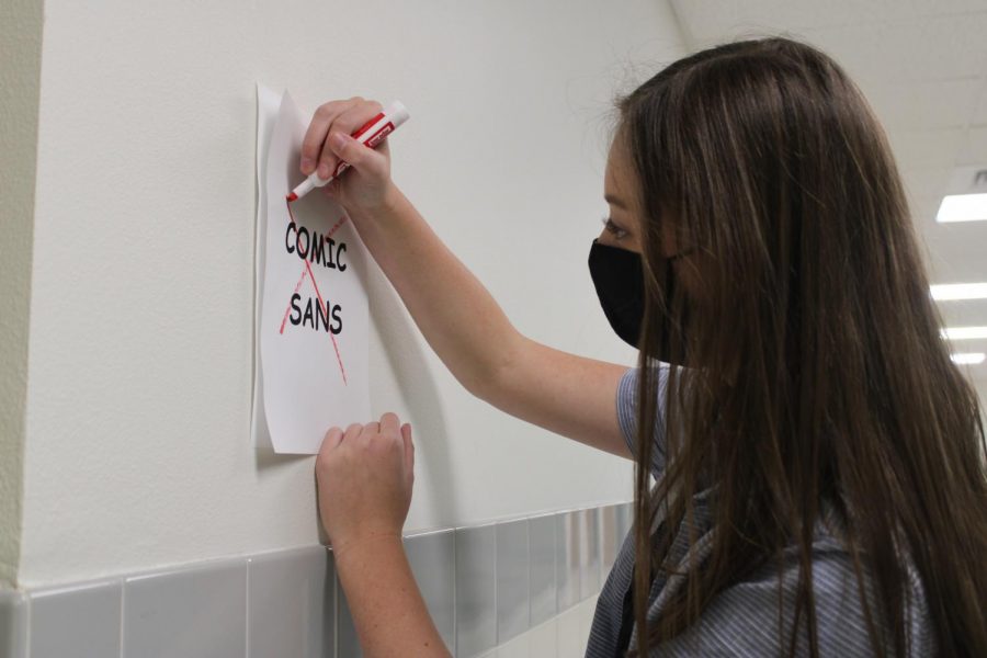
Prowl Editor Abby Landwehr uses red marker to strike out Comic Sans.
Stop using Comic Sans. Seriously, stop it.
If you ever find yourself in the need of a font in Microsoft Word and your mouse hovers over the “Comic Sans” font choice, remove your hands from the keyboard, get up and walk away. Because you should NEVER be allowed on Microsoft programs again. EVER. What are you? A kindergarten teacher writing their newsletter?
Comic Sans has been terrorizing the world since 1994 with its round lettering and juvenile style.
Sierra Sauskojus, a graphic designer for an organization based in South Carolina, said that the font’s original purpose is no longer its singular use.
“This typeface was meant for attracting children, but suddenly it’s seen on posters with urgent messages, in stores and restaurants, on the sides of vehicles, and numerous other places,” Sauskojus said. “It’s not that we loathe comic sans, but we kind of do.”
The font has been widely overused and is quite frankly, getting on my nerves. It’s been on the display of logos and posters, it’s time to retire the font once and for all.
Look, I get it. Why take graphic design advice from a kid who learned graphic design in elementary school through making PowerPoints on the desktops in Mom’s classroom? You’d probably prefer to listen to someone with 20 years of experience, right?
So here’s someone with 20 years of experience to tell you why Comic Sans sucks
“Comic Sans is a very cartoony font to me. It is extremely unprofessional looking to me,” the lead graphic designer for the Cody Enterprise Cassie Capellen said. “When I was in college at Northwest from 2010-2014 we had sign a pledge stating that we would never use comic sans in our college work. To this day I still refuse to use it.”
In that case, what fonts should you avoid? Well you’re in luck.
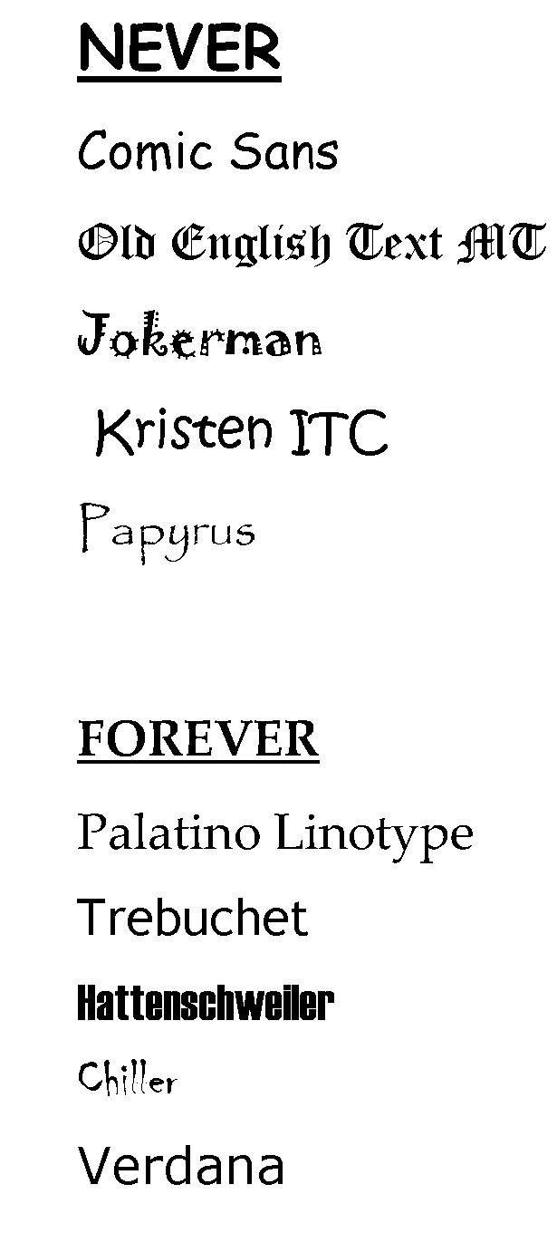
Here is a list of the top 5 God-awful font choices available on Microsoft Programs:
- Old English Text MT.
This is not the medieval times, the closest kingdom we have around here is a Burger King the next town over. Put away the virtual quill. Please.
- Jokerman
I really can’t describe it, it just makes me think of a 4-year-old’s circus themed birthday party and has no other uses.
- Kristen ITC.
This font absolutely seems like it would be Comic Sans’ older brother. This font has many of the same problems I have with its younger sibling.
- Papyrus.
I lay awake at night thinking about the Avatar logo. It’s just a slight variation of the Papyrus font and some professional graphic designer got away with it.
- Comic Sans.
I would not use this font for anything, even if it was the last typeface on the planet.
Honestly, 2020 has been a mess. Considering everything that’s happening right now, let’s make the world just a little bit better by ridding ourselves of Comic Sans.
So which fonts SHOULD you use? Prowl Adviser Mr. Vin Cappiello offers the following (in his words):
Palatino Linotype: It’s Times New Roman on steroids. ‘Nuf said.
Trebuchet: Classy. Big. Original. And great for students who ascribe to the 12-point text assignment limit in order to write less on five-paragraph essays.
Hattenschweiler: If for no other reason, use it because of the name. Period.
Chiller: Perfect for all things evil.
Verdana: The Dad-bod cousin to Trebuchet, this rather portly typeface is perfect for all you underachievers out there.